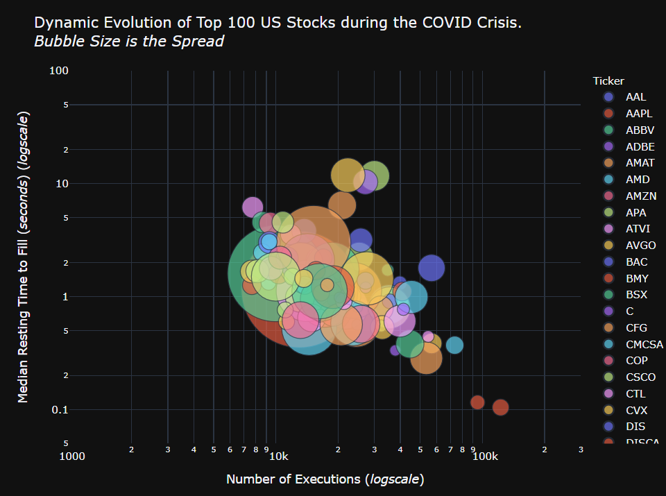
The US market moved from a passive state of tighter spreads, lower volumes and longer resting times during January and early February to a much more aggressive state in late February and March through April.
As a result of Covid-19 and its immeasurable impact on the global economy, we have seen unprecedented levels of volatility and volumes in the equities market. Overall trading volumes on primary exchanges have risen sharply, 2-3 times above pre-COVID-19 levels, while spreads have widened significantly and daily intraday volatility spiked at 25% price swings.

For interactive charts, open this page on desktop
The current state of the market can best be quantified by examining 3 key measures of volatility - number of executions, bid-offer spread and the time an order sits on the book before being executed.
Since the start of the year, the number of executions have increased 350% for US traded stocks, spreads have widened to ~340bps at their widest up from an average of ~6bps; at the same time, average order resting times have come down from ~20 seconds to 0.5 seconds. These indicate that market participants were aggressively crossing wider spreads more quickly and in greater size, resulting in higher costs to trade and more volatile price swings as real money exited more risky positions.
The BMLL Team has produced an interactive timeline showing the evolution of these volatility analytics for the top 100 traded US stocks since 15th January.
The top left hand corner of the plot represents a more passive market characterised by smaller volumes and longer timespan between orders being placed on the market and being filled; the bottom right indicates a more aggressive market with larger volumes, shorter times to orders being filled. As the timeline progresses, the average bubble size increases for most stocks, indicating an increase in daily bid-offer spreads. The bubbles move from central positioning on the plot to a very aggressive position in the bottom right corner.
The plot is interactive allowing users to select individual securities by double clicking once on the ticker symbol in the legend and hover over each bubble to visualise the underlying data.
Notes:
- The Y-axis represents the average order resting time
- The X-axis represents the number of executions
- The bubble size represents bid-offer spreads